Generating leads is the most important component of marketing.
When you turn a site visitor into a lead, and then that lead becomes a customer, you’ve done your job, but you need to follow up on that accomplishment. As the experts at HubSpot say, “A successful lead generation engine is what keeps the funnel full of sales prospects while you sleep.”
With so many moving parts involved in successful lead generation, it’s easy to lose sight of some of the tactics available for use. That’s where this blog post comes in — we’ll cover the most popular and effective techniques utilized by marketers today to increase leads and generate revenue. Let’s get started!

The Mechanics Of Lead Generation
Before we dive into the 30 tips, we should first cover the mechanics of lead generation. The best lead generation campaigns contain most, if not all, of these components. From a tactical perspective, a marketer needs four crucial elements to make inbound lead generation happen.
These include:
Offers
An offer is a piece of content that is perceived high in value. Offers include eBooks, whitepapers, free consultations, coupons and product demonstrations.
Calls-To-Action
A call-to-action (CTA) is either text, an image or a button that links directly to a landing page so people can find and download your offer.
Landing Pages
A landing page, unlike normal website pages, is a specialized page that contains information about one particular offer, and a form to download that offer.
Forms
You can’t capture leads without forms. Forms will collect contact information from a visitor in exchange for an offer.
The tips in this blog will cover each of these elements so that every component is fully optimized to help you generate the most leads for your business. Also, be sure to bookmark our Essential Dictionary of Industrial Marketing Terms as a reference for other keywords throughout this post.
Creating Irresistible Offers
Goal: Make them say “yes.”
Tactic: Portray the offer as hard-to-get. When something is difficult to attain, its desirability grows.
Content: What should the offer be? Your offer can be whatever you want it to be, as long as attracts leads. In the industrial space, this is most often a whitepaper, infographic, or eBook. Offers can also be free trials, memberships, and sales promotions.
Reminder: People will offer personal information when they feel that the value of what they are about to receive is equal to what they are about to provide. We’ll give you advice on how to make the offer enticing.
1. Use The Element of Scarcity
If you look at the principle of supply and demand, you’ll notice that when supply is limited, demand goes up. Scarcity has a psychological influence on us, making us want something even more if there isn’t enough to go around. Scarcity creates a fear of shortage, and a sense of urgency, which is helpful for marketing.
Limited Time Offers
Limited time offers are among the most popular in the scarcity category. Just think about your average car dealership. Practically every commercial is a limited time deal. “Get 0% financing before it’s gone!”
Limited Quantity
When something is of limited quantity, it suddenly becomes more unique or exclusive. In some studies, limited quantity or supply offers have outperformed limited-time offers. Why? Because it’s hard to tell when an offer of limited quantity will suddenly become unavailable, while a time-based offer has a known end time. Limited quantity offers are good for not only getting people to say “yes” to your offer, but to avoid procrastination completely.
Limited Time and Limited Quantity
Industrial trade shows are the perfect example of using both tactics. Deals end within a certain time frame, and they limit the number of people who can buy a ticket with certain perks. That’s a powerful combination. They also package scarcity tactics with discounting, which is another great value-add (something to consider for all e-commerce).
2. The Bandwagon Effect
It’s a natural tendency for humans to copy one another, even without realizing it — we like to be a part of tribes and social communities. So when we notice our social circle is doing one thing, we tend to follow suit. One great way to make an offer more valuable is to show that other people are participating in that offer.
Proof in Numbers
When possible, a great way to indicate how awesome an offer is to mention the number of people who have purchased, downloaded, signed up, or donated.
Some examples include:
- Webinars: On webinar sign up pages, you can indicate the number of people who have signed up and encourage them to join the conversation on social media.
- Social Share Icons: Many industry blogs have “share” buttons at the top or bottom, which indicates the people who are talking about this post on social media. This shows the post is trustworthy and popular blog to talk about and share.
- Conferences: Events such as IMTS and the Women In Manufacturing Summit are some of the hottest because of the attendance numbers and networking.
Just make sure your claims are not only true, but believable.

3. Leverage Newsjacking
When Ford announced the F-150 would have an aluminum body a few years ago, everyone — from big-name news outlets to random Twitter users — down, around and inside supply chain had an opinion on it.
Some of the automotive giant’s biggest competitors ran negative advertising campaigns. Automotive bloggers took to their keyboards to dissect the news. And the smart manufacturers and industrial companies took this opportunity to newsjack — meaning capitalizing on something buzz-worthy to help give your business a boost.
In situations like this, you can align offers with “what’s hot” — this type of technique works very well for your company’s blog posts, website content and downloadable offers.
Don’t over complicate this. It can be something as simple as discussing one of your company’s offerings during an industry uptick or when a particular sector is gaining momentum.
/_30%20Assets/ESI%20Live%20Solar.png?width=447&name=ESI%20Live%20Solar.png)
Take a look at Engineering Specialties, Inc. as an example. There’s plenty of chatter about “green” practices and recycling every year in April to celebrate Earth Day, and they wanted to capitalize on it. So at the height of the news cycle, ESI pushed out a blog about the company’s solar panels and even put a link to their live solar panel feed — a really unique CTA!
4. Focus On Creating An Amazing Title
Brian Halligan, HubSpot CEO and co-founder, once said that “you can have a great offer with a bad title and no one will download it. But if you have an amazing title, suddenly everyone wants it.” Yes — people do judge a book by its cover. If your offer is a piece of content, such as a whitepaper, eBook, or presentation, put effort into creating an amazing title.
For an experiment, HubSpot changed the title of an eBook and ran an A/B test to see which one would perform better. They took the original title “The Productivity Handbook for Busy Marketers” and changed it to “7 Apps That Will Change the Way You Do Marketing.”
/Screen%20Shot%202017-11-03%20at%2011.46.46%20AM.png)
As you can see above, the revised version outperformed the original by 776%. What this means is that it resulted in more leads.
It’d be interesting to see if your “Beginner’s Guide to Sheet Metal” outperformed “7 Tips For Choosing the Right Sheet Metal Supplier,” yes? Try it out — and check out our other A/B test examples while you’re at it!
5. Create Offers For Different Buying Stages
The most common offer seen on most websites is a “Contact Us” section or webpage. Sure, you want all your industrial leads to talk to sales, but not everyone is ready. As you know, buyers are more likely to do their own research before even engaging with a sales rep. And, every prospect is at a different stage of exploration. Some may need more education than others. That’s why it’s important to develop different offers at different buying cycles.
Someone at the top of the buying cycle may be more interested in an informational piece like a guide or ebook, whereas someone more committed at the bottom of the cycle might be more interested in new company info. You don’t need to pick and choose; create offers for each phase, and include a primary and secondary CTA to these offers on various pages throughout your site.
6. Avoid Corporate Gobbledygook
A professional image is necessary, and it’s enhanced when you can promote your message while avoiding corporate gobbledygook. What is gobbledygook, you ask? Great question.
Gobbledygook comprises jargon terms and phrases that have become platitudes through decades of overuse. These words are meant to add emphasis on a subject, but usually they just result in mockery from the person forced to listen or read them.
Avoid these words when describing your offers, and you’ll avoid falling into the traps of gobbledygook:
- Next Generation
- Flexible
- Robust
- Scalable
- Easy to use
- Cutting edge
- Ground breaking
- Best of breed
- Mission critical
7. Use High-Value Offer Formats
Not all offers are created equal. Some “formats” of offers perform better than others at converting leads. For example, what’s more valuable, a whitepaper or an eBook?
Below are the type of offers, in order of performance, that generate the most amount of leads:
- eBooks or Guides
- Templates or Presentations
- Research & Reports (ex: State of Inbound Marketing)
- Whitepapers
- Kits (multiple offers packaged together)
- Live Webinars
- On-demand Videos
- Blog posts (if there is a CTA in the post)
- Middle-of-the-funnel offers: Demo Requests, Contact Sales, RFP, Etc (more sales-ready offers).
While content marketing is at the heart of every inbound marketing strategy for effective lead generation, it’s important to test different types of offers with your audience to determine what works for you. While eBooks score high on our list, you may find that reports, videos or other formats do better.
Calls-To-Action That Rock
When you see an ad on the side of your screen while you’re browsing the internet, it usually includes a small button with the words “Learn More” or “Download Now.” These are Calls-to-Actions (CTA). They’re what drive people to your offer.
As such, they need to be captivating and persuasive; otherwise, you lose your audience and the ultimate sale. CTAs can be utilized anywhere on a site where it’s appropriate to market your offer. We’ll cover how to create CTAs that increase clicks for maximal impact so that visitors choose you rather than continue to search and end up on a competitor’s site.
8. Place Your CTA Where the Eye Can See
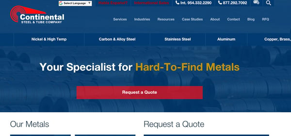
Calls-to-action do best “above the fold” — the space where your web page is viewable to the user without having to scroll down. According to heat map analysis, anything “below the fold” will only be viewed by 50% of people who visit your page. Doubling impressions on your CTAs can significantly increase your lead count. Notice the placement of the CTA on Continental Steel’s homepage below. The red CTA button is above the fold, near the top of the page.
9. Clarity Trumps Persuasion
Often times, marketers will put more focus on being clever than clear. Be crystal clear about what is in your CTA and be specific.
If you’re giving away a free guide, say “Download our FREE guide to X” and if it’s a free webinar, say something like “Register for our FREE webinar on X.” X should clearly convey a compelling benefit of receiving the offer. This is much more effective than “Download Now” or “Get a Free Article.” These simply aren’t specific enough. Click here for more examples of effective web design and CTA examples that have generated leads for our manufacturing clients.
10. Use Contrast to Make CTAs Stand Out
A call-to-action is meant to stand out, so if your CTA blends in too much with your site design, no one will notice it. You want as many eyeballs to land on that call-to-action as possible, so use contrasting colors to make the CTA conspicuous, and more importantly, design it in a way that its clickability is clean.
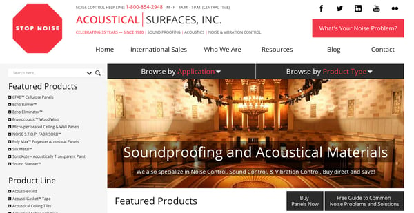
Take a look at how Acoustical Surfaces used a CTA that fits in their brand’s color scheme, but stands out against the white background.
11. Link Your CTA to a Dedicated Landing Page
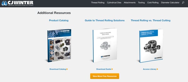
This tip might seem minor, but it’s incredible how often businesses miss this opportunity. Calls-to-action are meant to send visitors to a dedicated landing page where they receive a specific offer. Do not use CTAs to drive people to your homepage. Even if your CTA is about your brand or product (and perhaps not an offer like a download), still send them to a targeted landing page that is relevant to what they are looking for. Most importantly, use this opportunity to use a CTA that will convert them into a lead. For example, see how CJ Winter offers resources on landing pages below.
12. Promote Offers on Product Pages
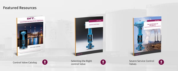
CTAs shouldn’t be one size fits all. If your company offers various products or services, you may want to consider creating a different offer for each. Then, you can place CTAs accordingly around the website. DFT Inc. does a great job of providing resources specifically for control valves on the company’s control valve product page. The logic here is that if a customer lands on this product page looking for control valves, the interest is there to download content specifically on that topic. This product page pushes the prospect to fill out a form and for you to capture their contact information.
13. Thank You Pages Are Great CTA Real Estate
Even if someone completes a form on your website (thus converting as a lead), you should try to increase their engagement with your brand. It is through this that prospects become fans.
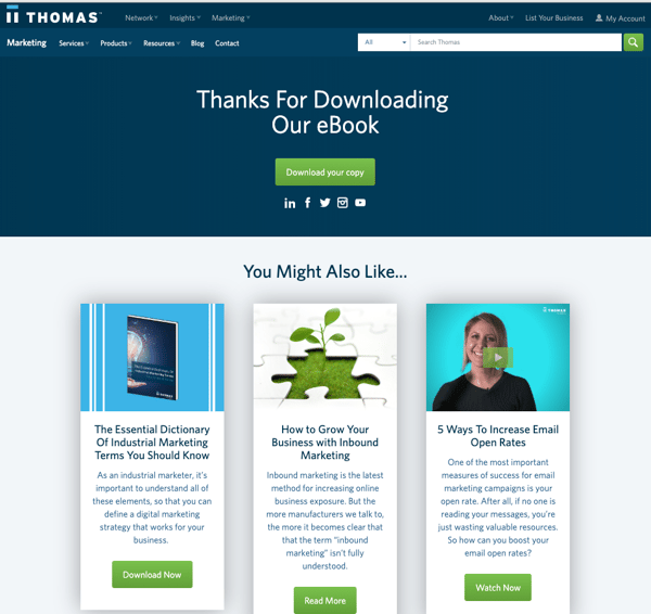
Once someone reaches a “thank you page,” use that space as an opportunity to promote more offers and content. For example, if a visitor on your website downloads a guide on email marketing, you can offer them another offer for a Email RFP for a chance to see a demo of our email marketing platform. Note that Thomas’ thank you page after submitting a form recommends additional resources and an offer to download.
Landing Pages That Convert
Landing pages are critical to capturing leads.
After a visitor clicks on a CTA, they’re directed to a landing page. On this page, free from distractions (as the navigational panels on your website are not visible here), visitors are motivated to offer basic information like their name and email so they receive the offer you’ve made so appealing.
14. Elements of an Effective Landing Page
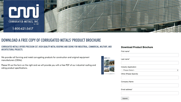
Landing pages, sometimes called a “Lead Capture Pages,” are used to convert visitors into leads by completing a transaction or by collecting contact information from them. Landing pages consist of:
- A headline and (optional) sub-headline
- A brief description of the offer
- At least one supporting image
- A form capture your industrial lead’s information
Corrugated Metals offers a perfect example of including all the elements of landing page for a brochure below.
15. Remove the Main Navigation
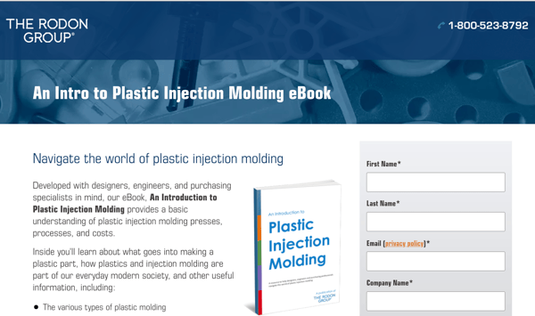
Once a visitor arrives on a landing page, it’s your job to keep them there. If there are links on the page to move about your website, it will distract the visitor and decrease the chance that they converting on the page. One of the best ways to increase your landing page conversion rates is to simply remove the main navigation from the page. Check out how simple The Rodon Group‘s landing page is.
16. Match the Messaging
Keep your messaging consistent on your CTA and the headline of the landing page. If people click on a link for a free offer and then find out there’s a catch on the landing page, you’ll instantly lose their trust. Similarly, if the headline reads differently than the CTA, it might lead to confusion, and the visitor might wonder if the CTA is linked to the wrong page.
17. Less is More
As you’ve noticed with these examples, when it comes to designing landing pages, simplicity is key. A cluttered page will distract your visitor. Be brief and to the point; it’s in the offer itself where you give more information. In addition to your headline, include a brief paragraph explaining what the offer is, followed by a few bullet points outlining the benefits of the offer.
18. Emphasize The Benefits Of The Offer
Make it clear in your brief paragraph and/or bullet points what the benefits of the offer are. It’s more than just listing what the offer is comprised of; it takes a bit of spin. Instead of “Includes specifications of product XYZ,” say something like “Find out how XYZ can increase productivity by 50%.” In other words, convey the value of your offer clearly and effectively. Remember — what information would your prospect be most interested in? Knowing who your targets arewill help determine the right copy for your webpages. Check out how Thomas’ landing page for 2019 Industrial Buying Habits tells you exactly what you’ll receive when you download the eBook. And note from #16’s tip above to “Match the Messaging” that our CTA content is aligned to the landing page’s content as well.

19. Encourage Social Sharing
On your landing page, don’t forget to include buttons to enable your prospects to share content and offers. Include multiple social media channels as well as email, since people have different sharing preferences. When your offer is shared more, more people land on the page, and more people fill out your form and become leads.

20. More Landing Pages Equal More Leads
A recent marketing benchmarks report states that companies who increase their number of landing pages from 10 to 15 see a 55% increase in leads. The more content, offers, and landing pages you create, the greater your opportunities for lead generation for your business. Need more inspiration on what type of content to offer? Check out these manufacturing content marketing ideas.
Optimized Forms
Forms are integral parts of landing pages, as they are what capture visitors’ information. Keep in mind that people will only provide information equal to their perceived value of the offer, so if this is an educational and high-level resource, keep the form relatively short.
21. The Right Form Length
You might be wondering how much or how little information you should require with a form. There is no magic answer when it comes to how many fields your form should contain, but the best balance would be to collect only the information you really need.
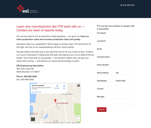
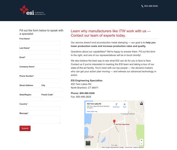
The fewer fields you have in a form, the more likely you will receive conversions. With each new field you add to a form, it creates friction (more work for the visitor) and fewer conversions. A longer form looks like more work and sometimes it will be avoided altogether. On the other hand, the more fields you require, the better quality those leads might be. The best way to determine what works best is to test it. Consider testing right vs. left alignment of your form too. Below is an example of an A/B test we did where saw a 75% increase in leads for the right aligned form!
Variation A: Right aligned form:
Variation B: Left aligned form:
22. To Submit or Not to Submit
That is the question your visitors are asking. If you’re seeing a high drop-off rate on forms, you could instead try to turn the statement into a benefit that relates to what they are getting in return.
If submitting the form will result in the download of a brochure kit, the submit button should say, “Get Your Brochure Kit.” Other examples include “Download whitepaper,” “Get your free eBook,” or “Join our Newsletter.”
Another helpful tip: make the button big, bold and colorful. Make sure it looks like a button (usually beveled and appears “clickable”). See #10 above to use contrasting colors for your CTAs.
23. Reduce Anxiety With Proof-Elements
People are more resistant to give up their information these days, especially because of the increase in spam. There are a few different elements you can add to the form or landing page to help reduce a visitor’s anxiety to complete the form:
- Add a privacy message (or link to your privacy policy) that indicates their email will not be shared or sold.
- If your form requires sensitive information, include security seals, a BBB rating, or certifications so that visitors know their information is safe and secure.
- Adding testimonials or customer logos is another great to indicate social proof. For example, if your offer is for a Free Trial, you may want to include a few customer testimonials about your product or service.

24. Make the Form Appear Shorter
Sometimes people won’t fill out a form just because it “looks” long and time-consuming. If your form requires a lot of fields, try making the form look shorter by adjusting the styling.
For example, reduce the spacing in between fields or align the titles to the left of each field instead of above it so that the form appears shorter. If the form covers less space on the page, it may seem as if you’re asking for less. You also can create the appearance of less work but implementing a multi-step form — one of our clients increased their leads by 67% using a multi-step form!
Multi-Channel Lead Generation
If you’ve optimized your website to rank well in Google, and designed it so that visitors want to stay once they’ve reached you, you’ve done well. However, your website isn’t the only way to generate leads. You should never forget the potential impact of your company’s social media platforms, email marketing campaigns, even text messages.
Buyers want to be wooed, and that means going to lengths to meet them where they’re most comfortable. Figure out who your target audience is and simplify their research, evaluation, and purchasing processes so that it’s most appropriate for them. That will return the largest dividends.
Check out the following channels that help businesses generate leads. Remember that this is not an exhaustive list, but a good place to start. In order to generate the most qualified leads, you must be where your all your buyers are — for example, is your business listed on Thomasnet? More than 1 million B2B industrial buyers are on the Thomas Network — and it’s free to sign up!
25. Blogging Brings In The Leads
Companies that blog regularly have a high chance of doubling their lead volume. The good news is that you don’t need to hit a ridiculous amount of posts to be noticed. Google takes note of regular updates on your site — even updates as little as once or twice a month will keep you up in the search ranks.
In every blog post, include hyperlinks to landing pages within the copy of the post, as well as a prominent call-to-action. We understand that blogging can be a lot of work, so don’t forget Thomas is here to help you with your content marketing needs. Check out our post “The Basics Of An Effective Manufacturing Blog” for other important elements to include.
26. Email Marketing
Many businesses may think that email marketing is only best used when communicating with existing prospects and customers. Not so! Email can be a great channel for new lead generation. Here are some ways you can use email to generate more new prospects:
- Focus on an opt-in strategy. If you’re buying email lists and spamming your prospects, no one will want to share your email with others. They will only want to unsubscribe! The first step to email lead generation is to make sure you have happy subscribers that enjoy receiving emails from you.
- Send people valuable offers. If you send really interesting or valued offers — whether it’s downloads, discounts or educational content — people will more likely share your emails with their friends or colleagues.
- Give people the tools to share. Don’t forget to add a “Forward to a Friend” link or social media sharing buttons within each email so people are encouraged to pass it on.
27. Social Media
Social media isn’t just for liking funny pictures or tweeting what you ate for breakfast. Social media and social ads are emerging channels that businesses now utilize to generate leads. Here are some tips for generating leads on social networks:
- Build a loyal following. Building a relationship with potential customers is a critical first step. Social media connections are really about people-to-people, not always company-to-individual. Get to know your audience online, communicate and share information. In order to generate leads, you need to have human interaction with others.
- Remember, social media is a dialogue. Companies that only use social media to blast out messages about themselves or send spam messages aren’t using social channels effectively. The goal is to interact with others and be helpful. When you share content on social media, don’t always post something that relates to your company. Share links to other interesting industry things you’ve found online. People will be very thankful you are noticing their work, too!
- Influence connections for content sharing. Publishing and sharing content that directs traffic to targeted landing pages is the single biggest lever to increase lead generation through social media. Share your new content offers by posting links to landing pages, and in addition, share blog posts, discounts, and other great resources.

28. Organic Search
While promoting your offers in many channels is crucial for lead generation, it’s also equally important to make it easy for people to find your landing pages through search engines. To do this, you need to apply search engine optimization(SEO) best practices to your landing pages, such as:
- Pick a primary keyword for each landing page and focus on optimizing that page for that word. If you oversaturate a page with too many keywords, the page will lose its importance and authority because search engines won’t have a clear idea of what the page is about.
- Place your primary keywords in your headline and sub-headline. These areas of content add greater weight to search engines.
- Include keywords in the body content, but don’t use them out of context. Make sure they are relevant with the rest of your content.
- Include keywords in the file name of images (e.g. mykeyword.jpg) or use them in the ALT tag.
- Include the keywords in the page URL.
29. Use Links And CTAs Within Offers
Your offers themselves are great channels for lead generation. Play around with CTAs in your blog and the look-and-feel of your CTAs too. Use the opposite end of the color spectrum with creating CTAs. For example, if your page is mostly blue and white, use orange or yellow for your CTA button or link color.
30. A/B Testing
While this isn’t a channel per say, it is a great way to increase leads across all channels and tactics. A/B testing can be used in calls-to-action, landing pages, email marketing, advertising, and more. According to HubSpot research, A/B testing your landing pages and other assets can help you generate up to 40% more leads for your business. When done correctly, A/B testing can provide a huge competitive advantage for your company.
Still Need Help Generating Leads?
As a marketer, your time and resources are valuable. Your aim is to generate the most qualified leads for your client in a cost- and time-effective way. Utilizing offers, calls-to-action, landing pages, and forms across a number of various channels will allow for laser targeting of audiences and drive more (and better) leads to your company’s site. Continual improvements and adjustments to your marketing strategy will benefit you in the short and long term. And if you need additional assistance on where to begin, shoot us a line.
