Manufacturing companies are known for innovation, but that brilliance doesn’t always shine through on their websites.
Far too many try to cram too much information “above the fold” and adhere to other outdated design principles. They try to be everything to everyone—investors, engineers, suppliers, prospective employees—rather than mapping out a logical path. Others function as more of a brochure than an interactive, responsive site.
So what makes the best manufacturing websites stand out?
We looked at dozens of sites and found the best ones all shared these features:
- Clean, simple design
- Large, striking imagery
- A strong hero message
- Simple navigation
- Clear calls-to-action and a path to conversion
- Opportunities to learn more
Based on these factors, here are six manufacturing websites that caught our attention.
Rockwell Automation
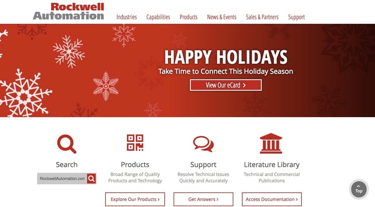
The path through this website couldn’t be more clear for users. Rockwell Automation directs visitors to explore its products, get answers to technical problems or access technical documents or search the site for something specific. The site’s designers and developers clearly have done their homework to understand what information current customers and prospects need upon visiting the site, and they’ve put it front and center.
Those who want to get to know the company better can explore the spotlight section and blog below.
Lockheed Martin
Lockheed Martin has a vast portfolio of the toughest and most sophisticated defense aircraft, aeronautics and more. To show off that impressive portfolio without overwhelming visitors to its website, the firm uses strong hero imagery with an expansive drop-down menu. Each item invites visitors to explore more.
The clean site navigation is laid out to explain who Lockheed Martin is, what they do, how they’ve made the news and how they’re innovating. It also makes it easy for prospective employers, investors, media, suppliers and employees to interact with the company.
Lear Corporation
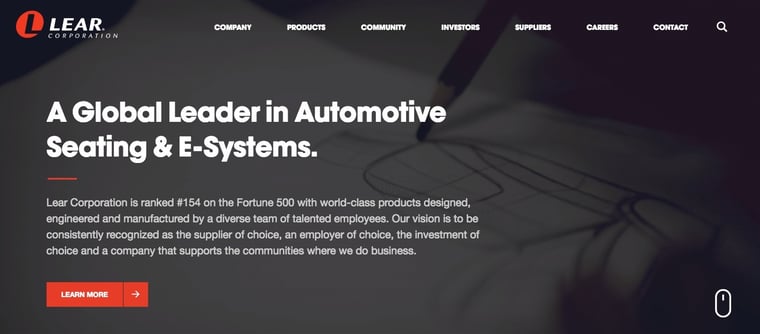
Immediately upon arriving at Lear’s website, visitors can see clearly that the company is a leader in automotive seating and electrical systems. It’s written right into the main hero message and illustrated in video in the backdrop.
Below, the responsive panels allow visitors to further explore its solutions, community involvement, careers and more. Next, visitors are invited to explore the showroom. Each item in the main menu has a number of subpages, but they are organized in such a way that the main site doesn’t feel too cluttered.
GTR Manufacturing
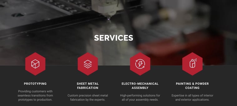
The website for GTR Manufacturing is as slick and precise as the sheet metal it fabricates. A dynamic video in the hero area demonstrates its impressive technology at work. Calls-to-action to view the company’s services and request a quote are prominent from the homepage.
It uses parallax scrolling to make the four services appear more prominent in the forefront, creating a two-dimensional effect. Below, the company features its capabilities, directing to an individual page for each (which is great for search engine optimization.) At the bottom of each capabilities page, visitors find a call-to-action to request a quote, making it easy to take the next step.
A background photo of the team tinted in the company’s dominant brand color offers a peek at the people who make the magic happen without taking away from the clean and professional design. Finally, a customer testimonial and call-to-action to request a quote wraps up the journey down the page.
Hatch Manufacturing
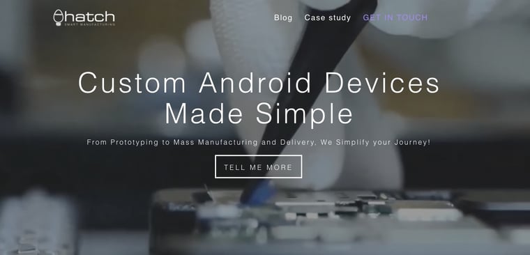
A company that specializes in developing Android devices should have nothing less than a fully mobile-responsive website, and Hatch certainly does. The site is clean and simple, with colorful CTAs and plenty of white space to make them pop. The ample white space evokes a feeling of efficiency and a seamless user experience that seems to mimic the experience of using a smartphone.
As visitors scroll, they find opportunities to learn more, such as a video, the eight stages of production, benefits of working with Hatch and its payment structure. There are also CTAs to explore Hatch’s clients and team members, see case studies and contact the company.
ShineWire
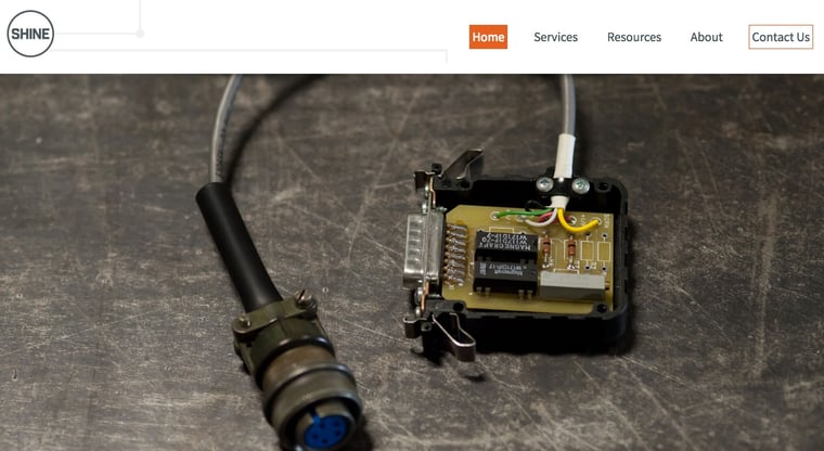
ShineWire is a custom cable assembly manufacturer that provides wire harnessing services and electro-mechanical assemblies for panels, vehicle chassis, computer fans and more. Its website highlights the durability and precision of these assemblies by featuring them front and center on the homepage.
The site’s developers clearly recognize its core audience—design engineers—and waste no time highlighting the best features of its products.
Make Your Manufacturing Website Stand Out
Great websites like these don’t happen by accident. They require research to better understand your buyers, their needs and how they make decisions. They need to be carefully mapped out by a team that not only understands the elements of great design, but knows how to create a seamless user experience. They should use the latest technology so they appear sophisticated and polished, and they should be built in such a way that it’s easy to capture visitors’ information.
When all these elements come together, your manufacturing website will become less of a boring brochure and more like a party (or at least a great networking event). It will serve as a well-stocked resource library, a source of inspiration and a wellspring for a steady flow of quality leads.
Want a website that better reflects your company’s commitment to innovation and is optimized for inbound marketing? Contact us to learn more about how we can help.
